Introduction:
There are a variety of mediums available to gain access to aerial images. Using an airplane or a satellite are common ways, with each equipped with a high resolution camera to capture the desired images. Each of these techniques tends to produce great quality pictures that can then be used in a variety of applications. But they also are extremely expensive ways to collect the data. A cheaper alternative to getting aerial images is through the process of balloon mapping. An earlier post in this blog detailed the construction of the various rigs that would be needed in order to house the camera securely to the balloon. This post covers the testing, flight, collection of pictures, and the mosaicking of those pictures.Methodology:
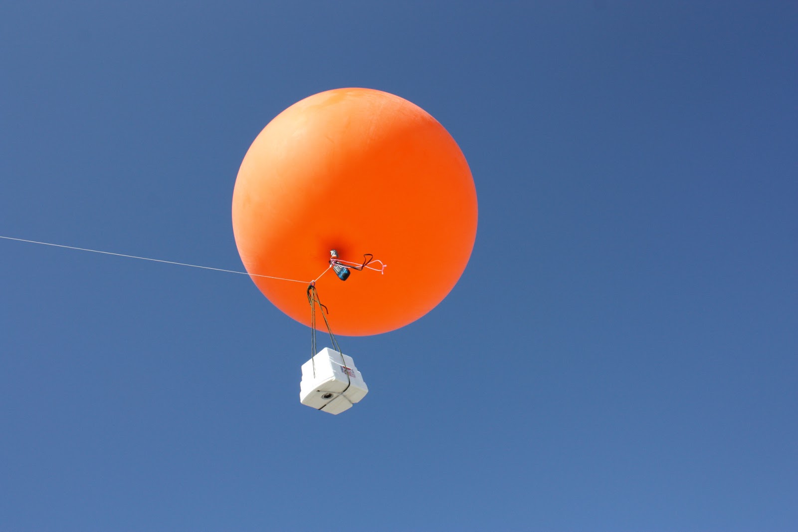 |
| Figure 1: The mapping rig, airborne and taking pictures |
After collecting the images, they were uploaded for the next step of mosaicking. A number of software options were available to us for complete this task. MapKnitter, a website that provides a freeware mosaicking program, ArcGIS 10.1, and ERDAS Imagine, provided the needed functions that we needed. In the first activity, MapKnitter was used to produce a mosaicked image, and ArcGIS was used in the second. The first task that needed to be done in any of the programs was to georeference the pictures. Georeferencing is a process involving relating the picture to a physical area in space. To do this, an aerial image of campus was used as a base map, and the pictures from the balloon were laid over the image, paying attention to scale of the picture. In MapKnitter, this was done by resizing, rotating, and stretching the images to produce a fluid grouping of pictures that looked like one image, instead of over ten. ArcGIS required setting ground control points, or GCPs for each picture on the base map. Placing good GCPs is a challenge itself, especially considering the current aerial images for the UWEC campus does not show the addition of the new student center, and all of the construction that is currently taking place. So good GCPs were obtained by using things like corners of existing buildings, light poles, lines painted on the streets, and, when nothing else was available, gaps in sidewalks. Images were selected based on the amount of overlap, which allows the operator to produce a better looking image that is more consistent, rather than simply selecting single images that show the area of interest, and then moving to another area that did not have any of the features from the first image in it. This also ensures that buildings, lightpoles, and streets are in the same perspective, generally speaking. In order for a visually appealing image, the parallax of each building should look like one is directly over a feature, instead of on the side of it, which would result in a warped view.
Unfortunately for this assignment, the lack of communication was an issue. The assignment was to use the images collected through the mapping rig to create a seamless image of the entire UWEC campus that had coverage. As this was an extremely time consuming task, campus was split into six sections. This seemed like a good idea at the time, but there was minimal communication between the groups, and this resulted in hardly any of the mosaicked TIFF files being uploaded into the geodatabase so that a total mosaic could be built.
Discussion:
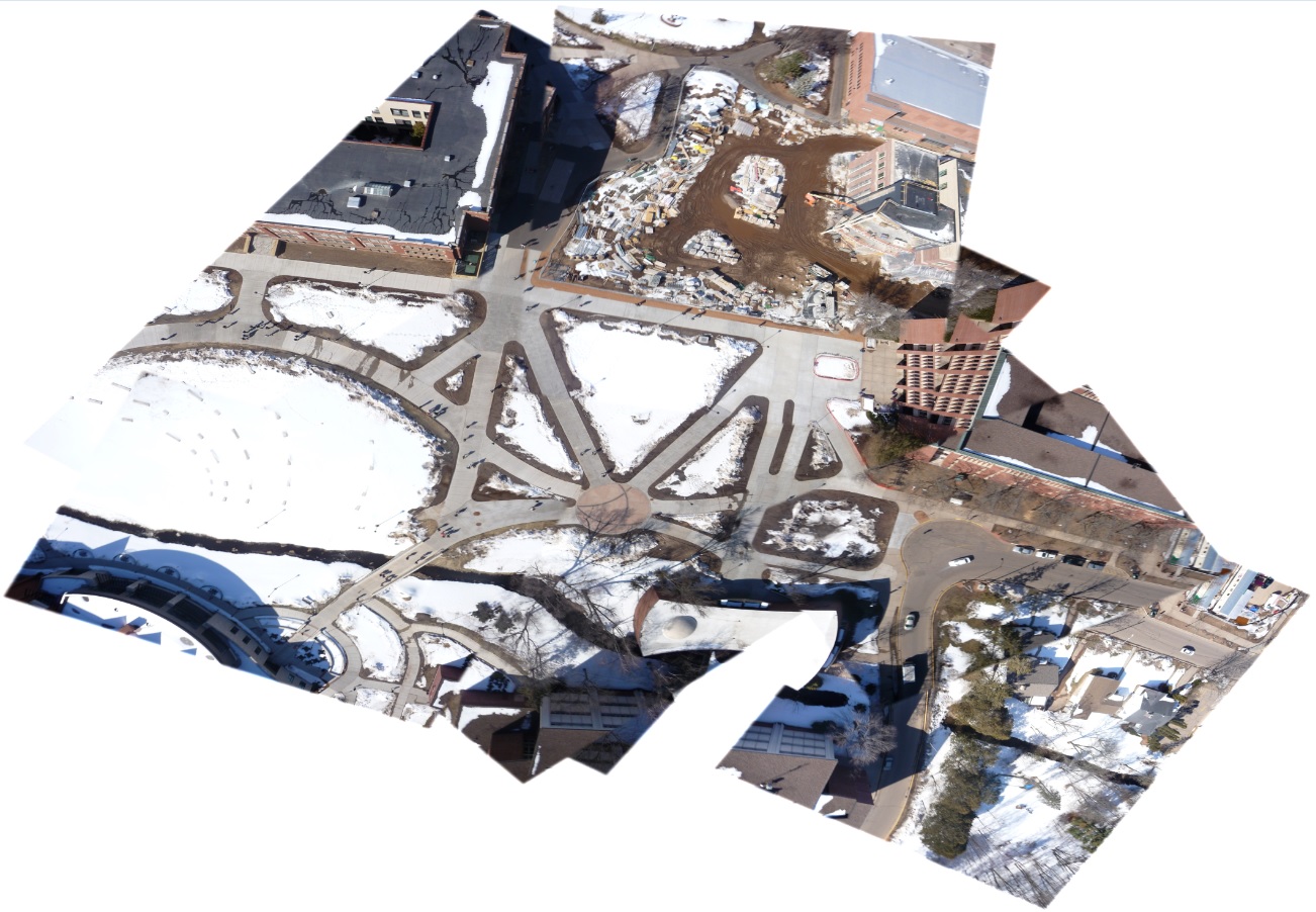 |
| Figure 2: Mosaicked image of the campus mall, produced with MapKnitter software |
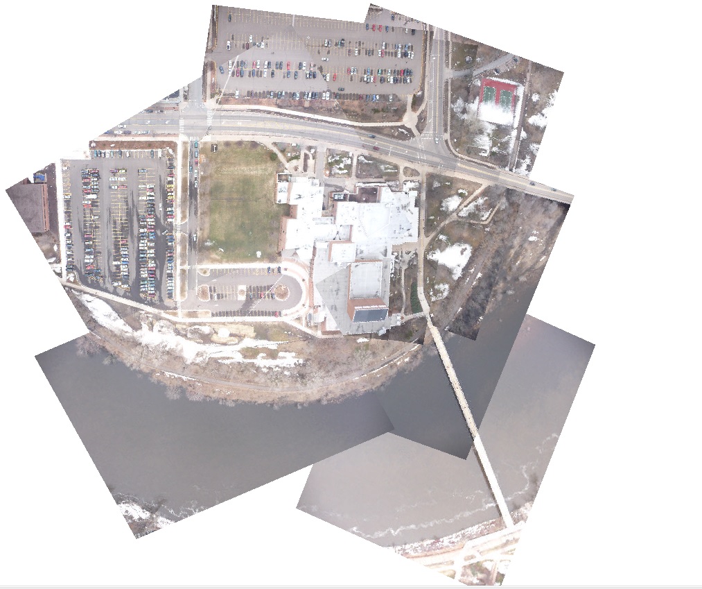 |
| Figure 3: Mosaicked image of our group's area using ArcGIS Desktop 10.1 to georeference and mosaic |
Conclusion:
This activity was an incredibly valuable experience. To the best of my knowledge, not too many people have done balloon mapping, especially in the scale that we had. The second balloon outing especially confirmed this to me, with close to 5,000 images being taken. This large amount of pictures ensured that issues like inadequate coverage, which was present in the first balloon activity, would never happen. The large number of pictures did create quite a daunting task, however, as going through them to find the image with the right amount of overlap, the desired features being clearly displayed, and ones with the rope from the balloon in the correct area to be covered up by another picture, was a time consuming process. After using both MapKnitter and ArcGIS to mosaic, it is clear that, despite its user friendly nature, MapKnitter was the worst of the two programs. The act of georeferencing and the placement of GCPs is critical to a good image, and ArcGIS is the software to use to do this effectively.
No comments:
Post a Comment