Introduction:
There are a variety of mediums available to gain
access to aerial images that can then be used for analysis in the future. Using an airplane or a satellite are common
ways, with each equipped with a high resolution capture device to take the
desired images. Each of these techniques tends to produce great quality
pictures that can then be used in a variety of applications. But they
also are extremely expensive ways to collect the data. A cheaper
alternative to getting aerial images is through the process of using a helium balloon equipped with a camera in continuous shot mode. An earlier post in this blog detailed the construction of the
various rigs that would be needed in order to house the camera securely
to the balloon, while still allowing for quality images to be taken. At this point in the semester, the weather was sufficient to take the balloon out and acquire images that can be then used for later analysis, since most satellite imagery of the University of Wisconsin Eau Claire does not cover the recent construction and renovation of campus. This post covers the testing, flight, collection of
pictures, and the mosaicking of those pictures.
Methodology:
Getting the Balloon Ready for Launch:
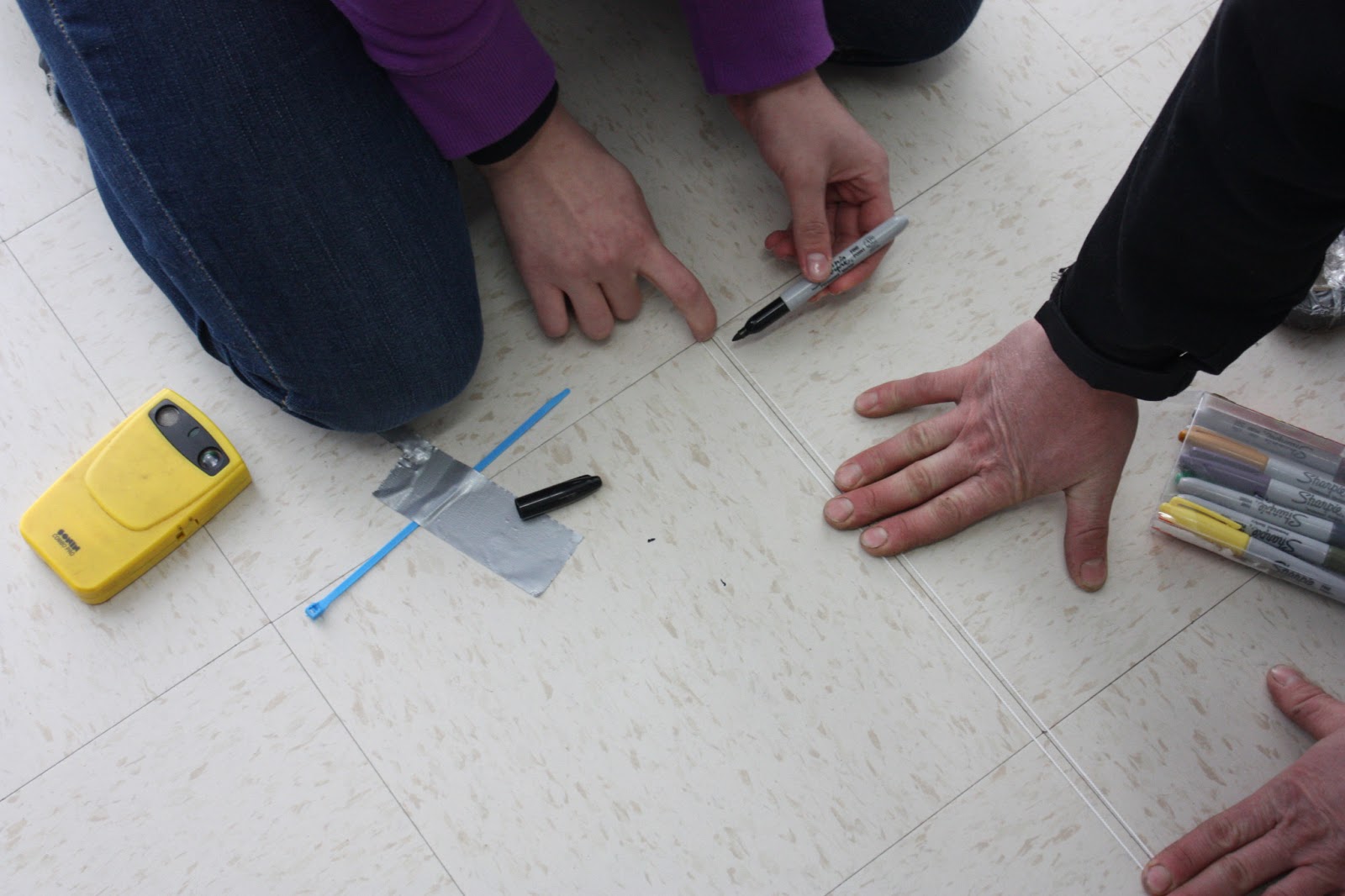 |
| Figure 1: Measurement of rope to determine distance of balloon in the air |
Deploying a helium balloon to take aerial photographs may seem like a fairly straightforward process, but it actually takes close to an hour of preparation. The first step involves the marking of rope segments at specific measurements to ensure that we had accurate height distances for each of the balloon flights. Figure 1 demonstrates how this was done. Segments of rope were measured at 100 meter increments, and then marked. Next, the mapping rigs needed to be examined to see how it would fly on the balloon. There was quite a bit of change from the first mapping rig, which can be seen in Figure 2, to the one that was used in the second mapping activity, shown in Figures 3 and 4. The first mapping rig did a sufficient job of protecting the camera, but was very susceptible to wind in the air, being fairly cumbersome and not very aerodynamic.
 |
| Figure 2: Examining the mapping rig that was used in the first mapping activity. |
 |
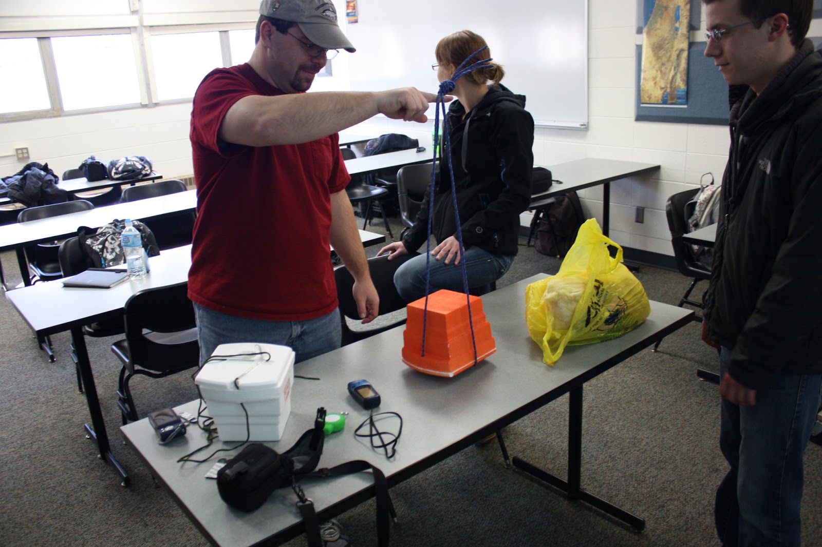
| Figure 3: Mapping rig used in the second activity, with bottle attached |
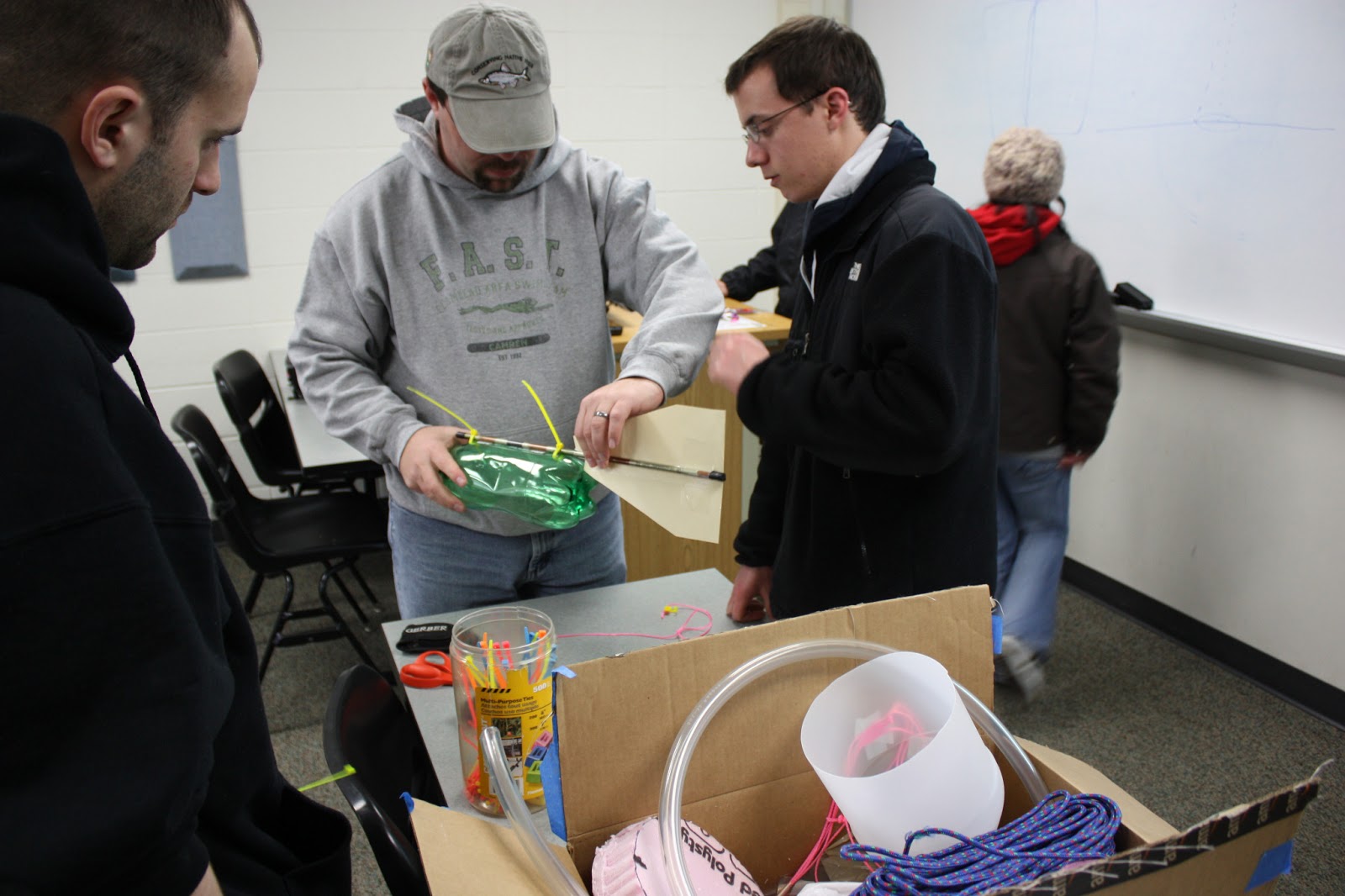
The design was reworked in the second mapping activity, taking this information into consideration. The rig initially had a two liter soda bottle that would house the camera, but this was determined to defeat the purpose of the arrow design. Instead, the bottle was removed from the design, and the camera was attached securely to the arrow itself, providing the best design to cut through the wind, which would keep the camera. and images that were taken, stationary.
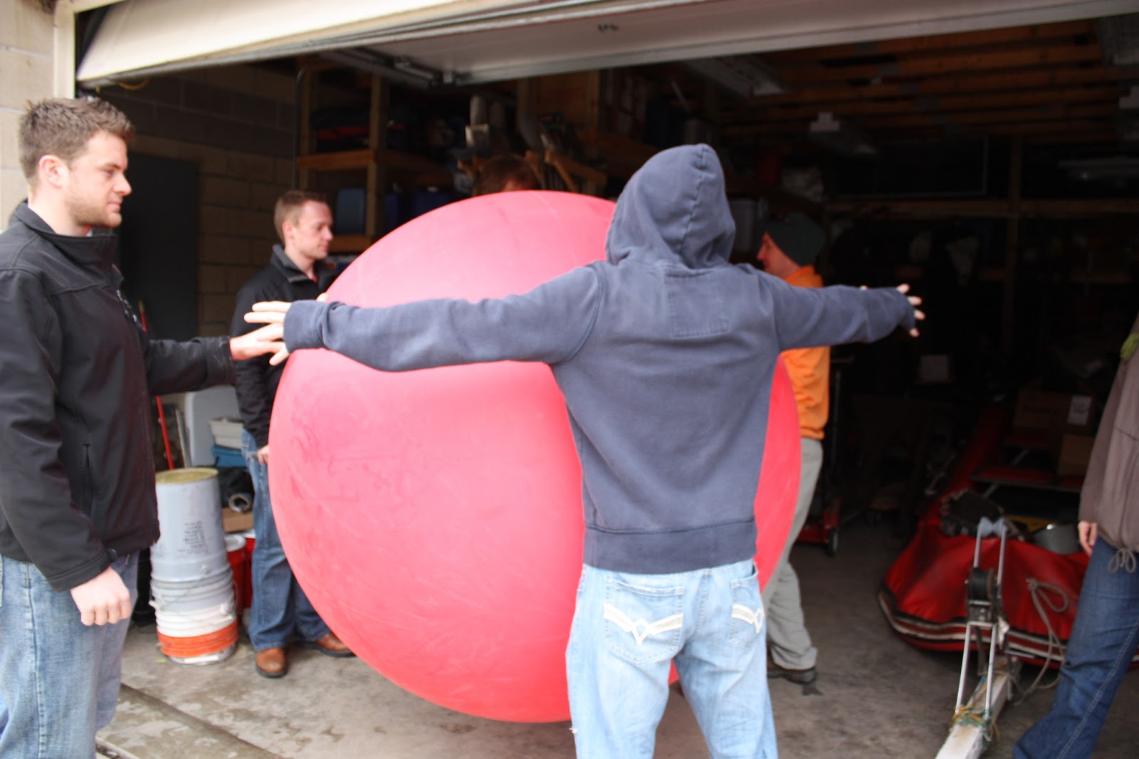
Filling up the balloon with helium was the next step. As the balloon, when fully inflated, was five and a half feet in diameter, this process took a long time to complete. Full inflation ensures that the balloon flies as high as possible, and that, in turn, guarantees the best possible pictures. Just how big the balloon got can be seen in Figure 5, with a student's wingspan being used a gauge to determine if the balloon was fully inflated at that point in time.
 |
| Figure 4: Mapping rig for second activity, with bottle removed |
 |
| Figure 5: Checking to see if the balloon was fully inflated. |
Flying the Balloon:
 |
| Figure 6: The first mapping rig, airborne and taking pictures |
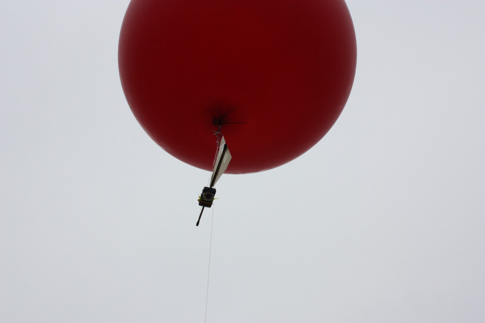 |
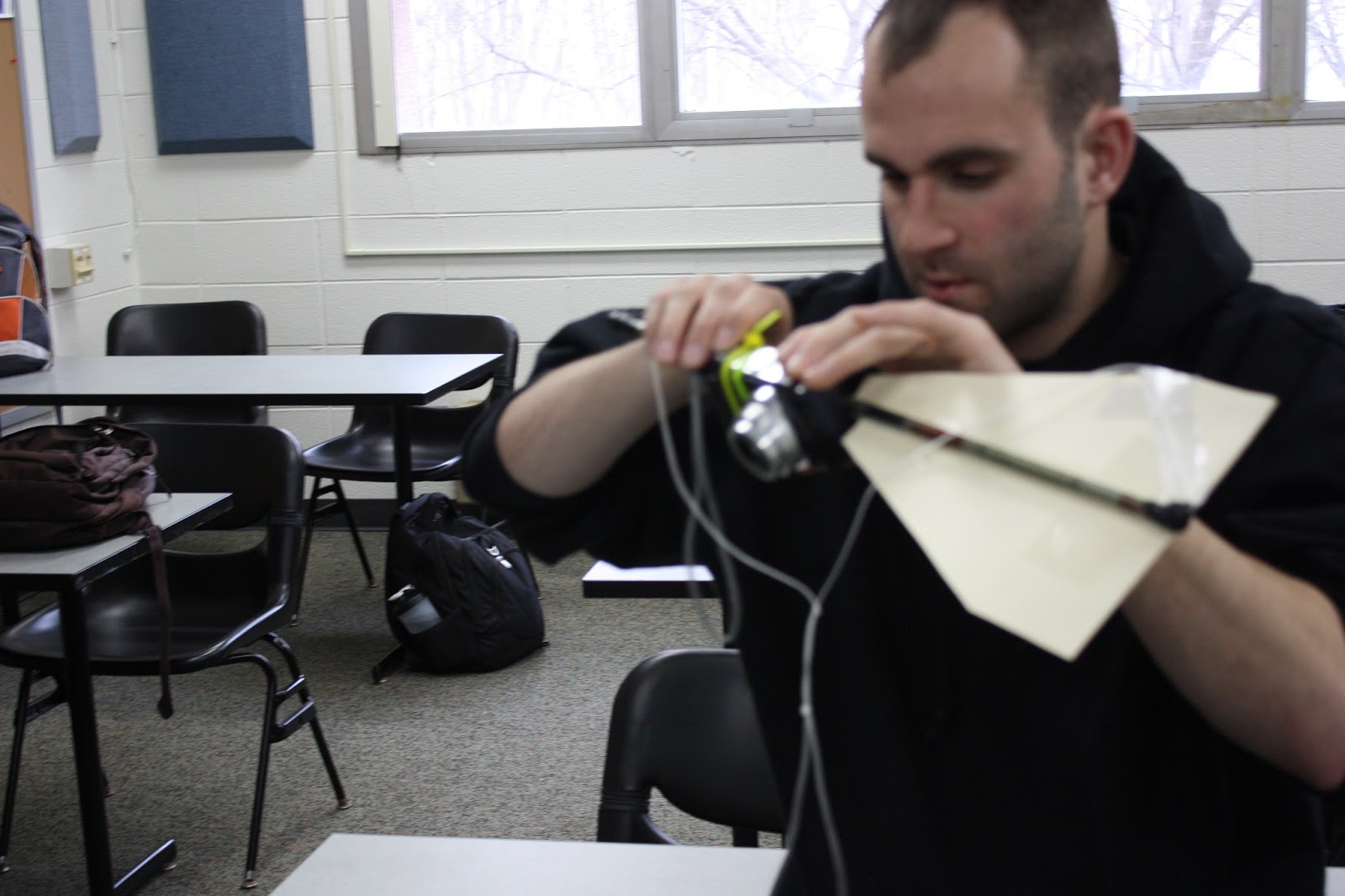
| Figure 8: The second mapping rig, which was considerably more aerodynamic. |
With our rigs constructed in Lab 3, and the weather
cooperating, we were ready to obtain some aerial pictures with the
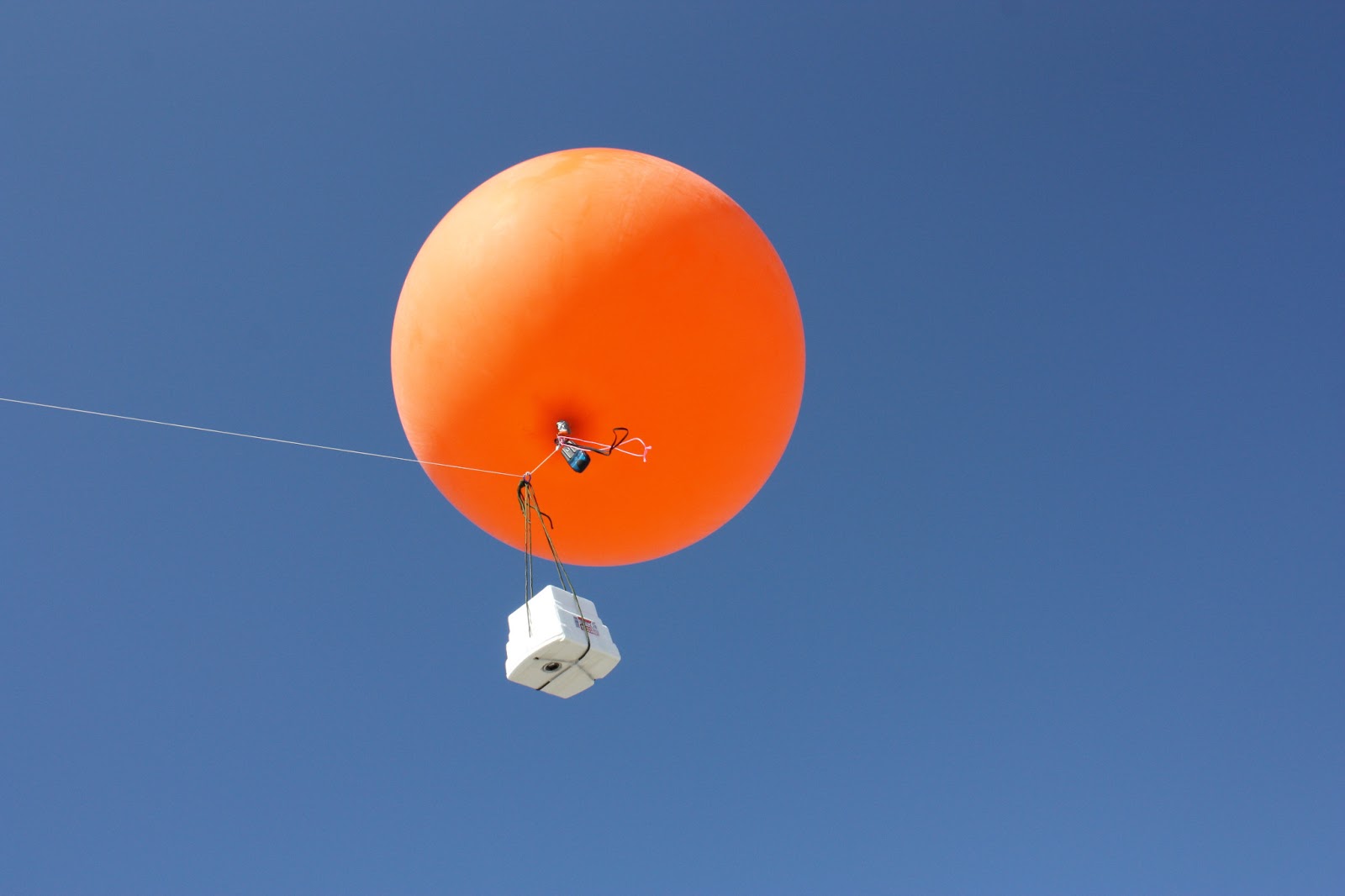
helium balloon. The total airborne object would consist of the camera
with a 32GB memory card, Styrofoam case, a Garmin E-Trex, a tracking
device, and the balloon, all of which can be seen in Figure 6. The second mapping activity had significantly less equipment with the camera, only consisting of the mapping rig and camera, as seen in Figure 7. Once in
the air, a walker on the ground would pull the string attached to the
balloon with them as they walked around the UWEC campus. The continuous
shot mode on the camera enabled many pictures to be taken in each
outing. The first balloon trip resulted in 321 images, and the second
trip managed to give us a staggering 4,846 images. The first round of
pictures were taken around the main academic center of campus, while the
second balloon trip covered a significantly greater area. In addition
to the main academic area, the Davies Student Center, Haas Fine Arts
building, and some sections of upper campus, where the residential halls
are located, were mapped.
Georeferencing:
 |
| Figure 8: GPS crew collecting ground control points for georeferencing process |
After collecting the images, they were
uploaded for the next step of mosaicking. A number of software options
were available to us for complete this task. MapKnitter, a website that
provides a freeware mosaicking program, ArcGIS 10.1, and ERDAS Imagine,
provided the needed functions that we needed. In the first activity,
MapKnitter was used to produce a mosaicked image, and ArcGIS was used in
the second. The first task that needed to be done in any of the
programs was to georeference the pictures. Georeferencing is a process
involving relating the picture to a physical area in space. To do this,
an aerial image of campus was used as a basemap, and the pictures from
the balloon were laid over the image, paying attention to scale of the
picture. In MapKnitter, this was done by resizing, rotating, and
stretching the images to produce a fluid grouping of pictures that
looked like one image, instead of over ten. ArcGIS required setting
ground control points, or GCPs for each picture on the basemap. Placing
good GCPs is a challenge itself, especially considering the current
aerial images for the UWEC campus does not show the addition of the new
student center, and all of the construction that is currently taking
place. So good GCPs were obtained by using things like corners of
existing buildings, lightpoles, lines painted on the streets, and, when
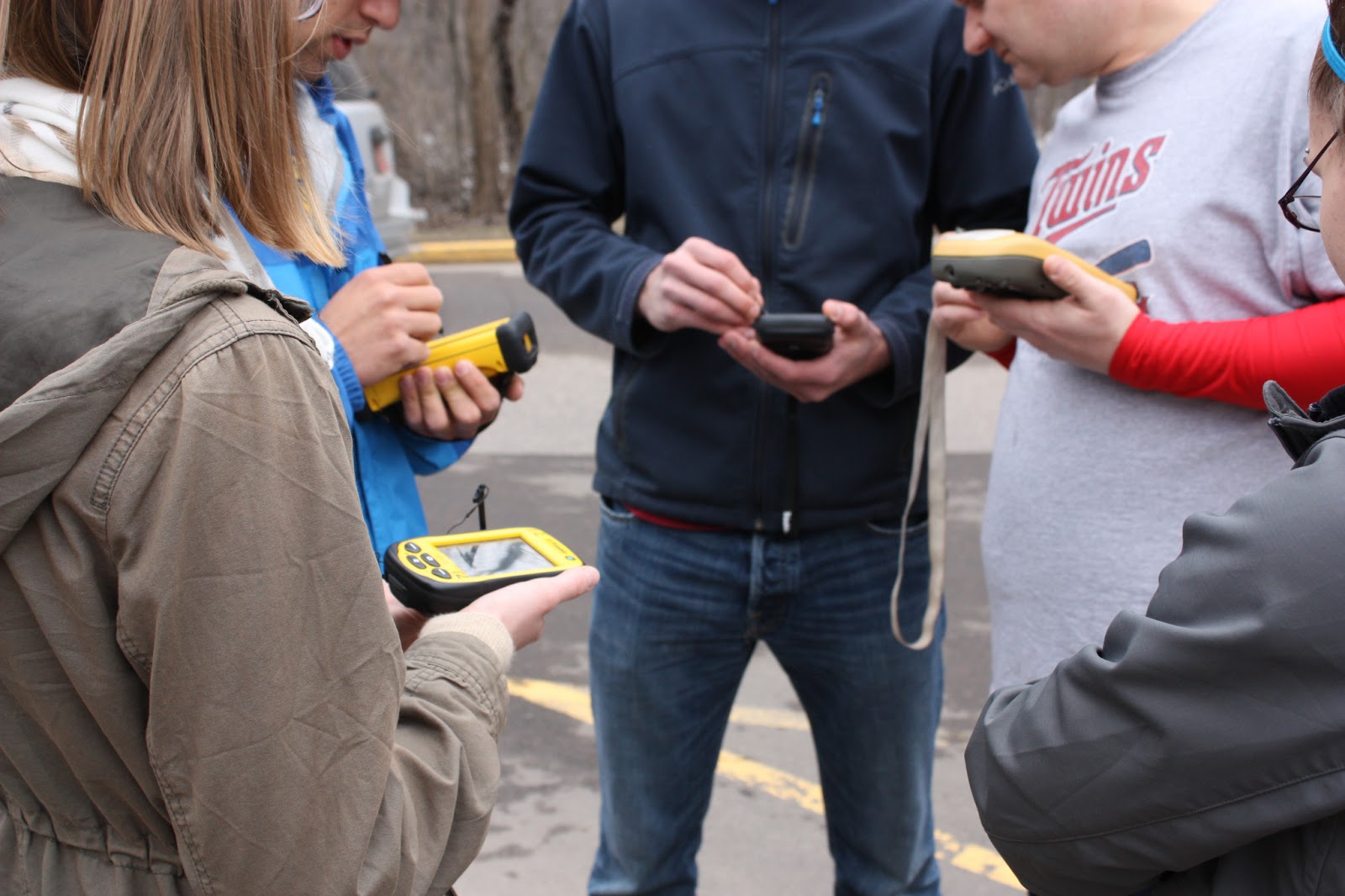
nothing else was available, gaps in sidewalks. In the second mapping activity, a group of four was walking around the main
areas of campus with Trimble Juno GPS units, seen in Figure 8. Their goal was to establish
mapping points that we could use in the georeferencing process. Getting these points would speed up the process, as it
would be simple to reference these points in multiple photos, ensuring
the highest degree of accuracy. Images were selected
based on the amount of overlap, which allows the operator to produce a
better looking image that is more consistent, rather than simply
selecting single images that show the area of interest, and then moving
to another area that did not have any of the features from the first
image in it. This also ensures that buildings, lightpoles, and streets
are in the same perspective, generally speaking. In order for a visually
appealing image, the parallax of each building should look like one is
directly over a feature, instead of on the side of it, which would
result in a warped view.
Discussion:
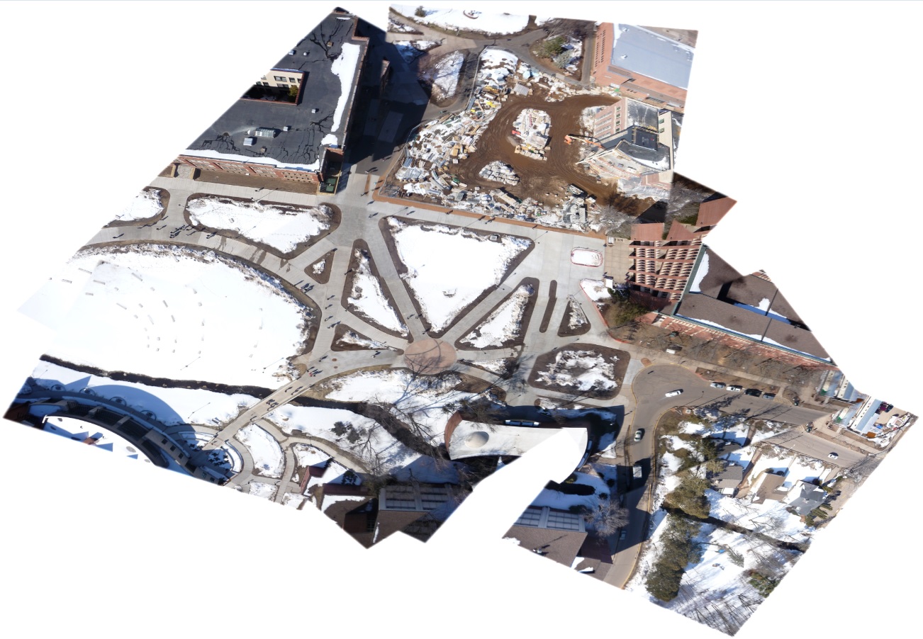 |
| Figure 9: Mosaicked image of the campus mall, produced with MapKnitter software |
When mosaicking the pictures and experimenting with
the software that was available for us, each had its benefits and
drawbacks. MapKnitter, for example, was extremely user friendly, using
simple functions like rotate, resize, distort, and different
transparency levels to place each picture in the correct spot at the
correct resolution. This made it simple to place the sidewalks in the
correct location, as it was only a matter of making one image
transparent, and then lining it up with the image that was already laid
behind it. Figure 9 shows the finished mosiac of the images from the
first mapping exercise, using MapKnitter. The ease of use for this
software was also its biggest drawback, however. Toned down for
simplicity's sake, MapKnitter lacked the more advanced functions of
mosaicking programs, notably the inability to place GCPs. Additionally,
the limited number of pictures taken in this first round, and the
relatively small area covered, did not allow for a complete scan, which
can be clearly demonstrated by the distortion of Schneider Hall, the
building on the far right in Figure 9. If more passes with the balloon
were taken near that particular area, more overlapping pictures could
have been taken, which woudl have resulted in a better quality image.
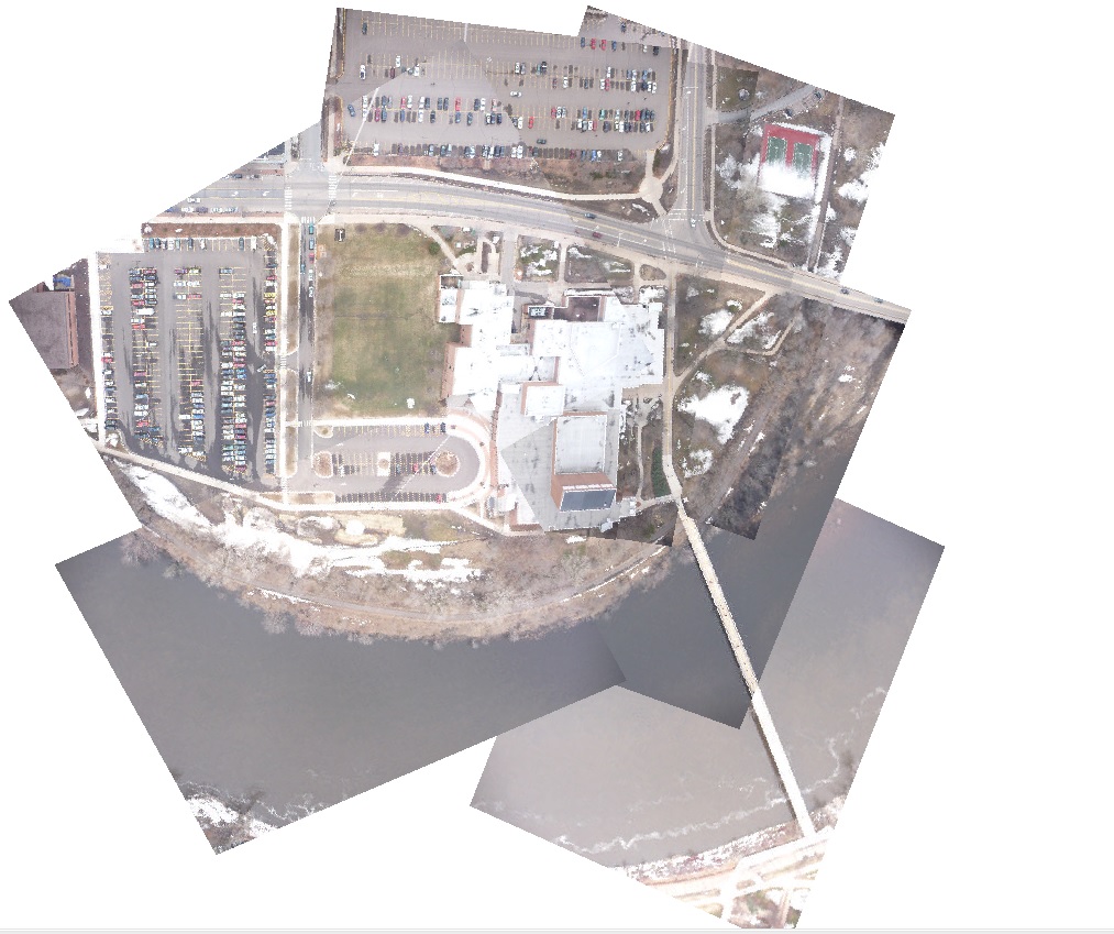 |
| Figure 10: Mosaicked image of our group's area using ArcGIS Desktop 10.1 to georference and mosaic |
Mosaicking in ArcGIS was a different process
altogether. The placement of GCPs was critical to having a correct
georeferenced image. To ensure this, at least 20 GCPs were used per
image, to eliminate the possibility that the image would shift due to
the placement of a point in an isolated section of the image. Having
these GCPs, in addition to a significantly larger area covered and
pictures taken, did make for a better finished image, which you can see
in Figure 10. Despite the number of pictures taken, the mosaicked images
appears more or less seamless, the goal of the project. The only real
problem with this mosaic is the lack of coverage on the south side of
Haas Fine Arts center, the large building in the middle of the picture.
This is due to us pulling in the balloon, to check if the camera was
still taking pictures. After checking that everything was still
functional, we did not deploy the balloon again until we crossed the
footbridge back to the main area of campus. Had we had the balloon up in
the air during that walk, a better group of images would have been
taken on the south side of Haas, and would have resulted in a more
complete picture.
With the ultimate goal being the production of a single aerial image of the entire campus and surrounding area, the class was divided into six groups to each produce a mosaicked image of a particular area of campus. Once this was done, each of the images would then be mosaicked together to produce a single image of campus, which can be seen below in Figure 11. While being by no means the quality image of something like Google Earth, for the most part, the final image is a highly accurate and detailed picture of the University of Wisconsin Eau Claire campus.
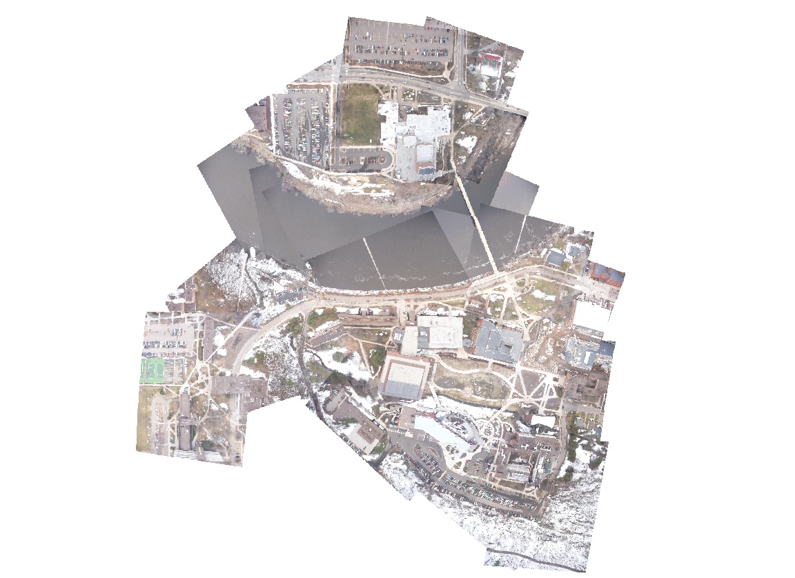 |
| Figure 11: Final mosaicked image of all six group's areas using ArcGIS Desktop 10.1 to georeference and mosaic |
Conclusion:
This activity was an incredibly valuable experience.
To the best of my knowledge, not too many people have done balloon
mapping, especially in the scale that we had. The second balloon outing
especially confirmed this to me, with close to 5,000 images being taken.
This large amount of pictures ensured that issues like inadequate
coverage, which was present in the first balloon activity, would never
happen. The large number of pictures did create quite a daunting task,
however, as going through them to find the image with the right amount
of overlap, the desired features being clearly displayed, and ones with
the rope from the balloon in the correct area to be covered up by
another picture, was a time consuming process. After using both
MapKnitter and ArcGIS to mosaic, it is clear that, despite its user
friendly nature, MapKnitter was the worst of the two programs. The act
of georeferencing and the placement of GCPs is critical to a good image,
and ArcGIS is the software to use to do this effectively. Since there has not been much prior documentation on the process, we
were left to our own devices as to how to conduct the process. This was a
learning experience for the entire class, since nobody had ever
mosaicked pictures taken from a device that they had control of. But by being involved in the entirety of the process, we gained a real appreciation of what was needed to get a quality image of the UWEC campus. There were issues that occurred while mosaicking, such as dealing with software issues like the mosaic not finishing, or the order of the pictures being incorrect. But this forced us to understand the entire georeferencing and mosaicking process, and by the end of the activity, we went from being relatively inexperienced to being proficient at it. Knowing how to georeference correctly is an important skill set for any person conducting GIS analysis, and this activity gave us a trial by fire to ensure that we knew exactly what we were doing, leaving us with knowledge that we can use in countless applications.


.png)
.png)
.png)
.jpg)


.png)
.png)